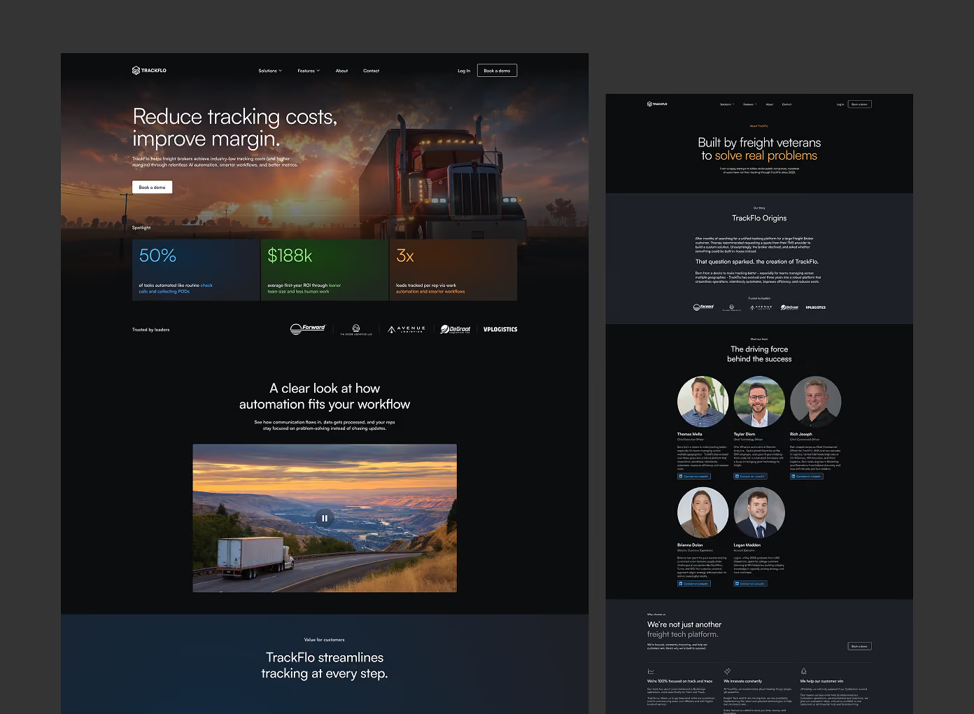
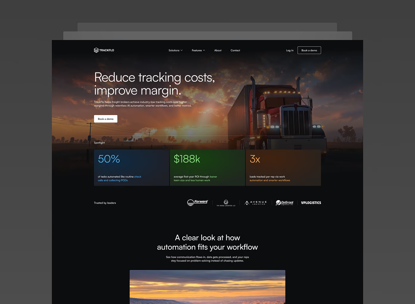
TrackFlo came to us with a website that no longer matched the maturity of their product. The existing site felt dated, lacked clear messaging hierarchy, and wasn't converting visitors into signups the way a modern SaaS platform needed to. We led a complete redesign and rebuilt the site in Framer, focused on sharpening the UX, clarifying the product story, and giving every page a clear conversion path.
The Need
TrackFlo needed a website that could:
Clearly communicate what the product does and who it's for, without overwhelming new visitors
Reflect a modern, credible SaaS brand that matched the quality of the product itself
Guide visitors toward key actions (sign up, demo, trial) with a clearer conversion path
Be built on a platform that allowed for fast iteration and easy content updates going forward
Solutions
Design
Audited the existing site to identify UX friction points and messaging gaps
Redesigned the information architecture to prioritize clarity — leading with value proposition before feature depth
Created a modern visual system with improved typography, layout hierarchy, and consistent UI patterns across pages
Designed each page around a clear primary action, reducing decision fatigue for visitors
Framer Development
Built the full site in Framer, translating the redesign into a fast, responsive, production-ready site
Implemented smooth interactions and micro-animations to reinforce a modern, polished feel without slowing down performance
Structured the site for easy content management, allowing TrackFlo's team to update copy and sections independently
Results
Delivered a complete visual and structural overhaul, repositioning TrackFlo as a modern, credible SaaS product
Improved UX and page clarity, giving visitors a clearer path from landing to conversion
Handed off a fast, easy-to-maintain Framer site that TrackFlo's team can iterate on without developer support